A few weeks back, a friend and I were discussing the advances in modern web design when the issue of website width came up. As you can probably guess, website width is how wide a website will be relative to the resolution of the screen being used to view the website. There are a multiple ways to define a websites maximum width, but I will be focusing on fixed-width and variable-width methods. Fixed width means that the website will always be at the same pixel width, no matter the screen resolution. Variable width websites grow with your screen (up to a certain point) and offer the user a full screen approach the web.
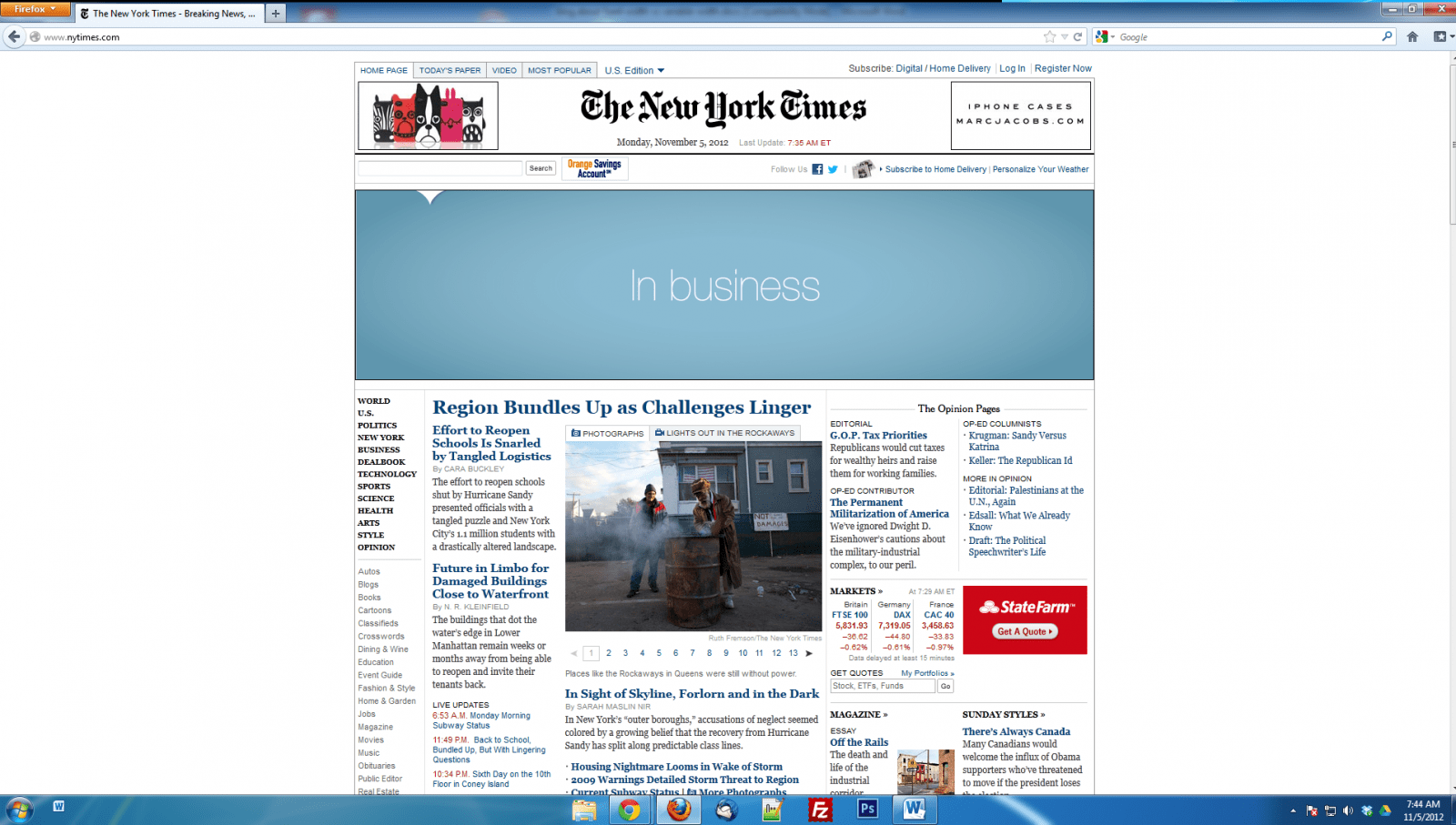
As a web designer I strongly prefer the fixed width websites that are 960 pixels or less. These fixed width sites look good on both computers and mobile devices. Dan Norris, a website designer in Australia, wrote an in-depth blog post comparing variable width websites to fixed width websites. Dan brings up many good points for fixed width websites, saying that they look good on most mobile devices, laptops and even PCs so long as the monitor isn’t huge. I think the need for fixed width websites is backed by the growing popularity of mobile devices. As more and more consumers are buying mobile devices, they are quickly becoming the normal way to surf the web, forcing us web designers to take the smaller screen size into account when we build our client’s websites. Since very few companies can afford to have multiple versions of their sites built (standard and mobile), us web designers go with what we feel will benefit the largest amount of users; the fixed width 960px layout. Most large ECommerce businesses and news based websites utilize the 960px layout as well. Some to note are Newegg.com, NYTimes.com, and Facebook.com (content fixed at 960px).

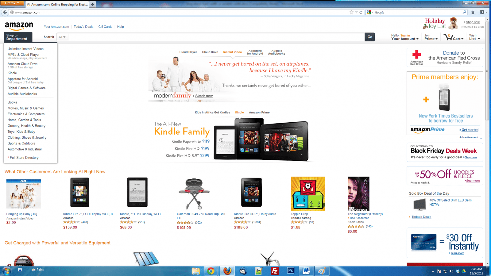
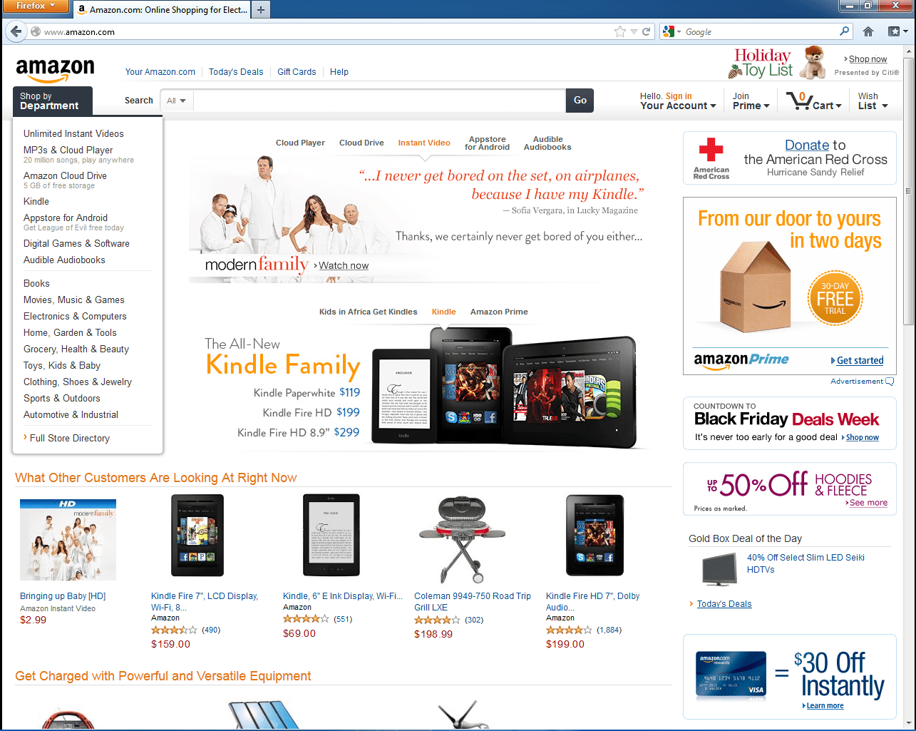
Variable-width websites can be nice if you spend the time and money to have it properly setup, maintained and an on-staff IT person to help debug errors. Some of the benefits of variable-width websites include the ability to show more information on larger screens, and utilize horizontal space to decrease the need for vertical scrolling. However, as nice variable-width websites may be, they have problems. For example, if you have ever browsed Amazon.com on a hand held device, you might find (as I did) that when you try to zoom-in on a product, the screen re-arranges itself, moving the content that you tried zoom-in on. This makes shopping on Amazon’s site a very cumbersome task while using a small mobile device like a phone. Also, if you are like me and have a large, widescreen monitor with high resolution, it can quickly get annoying having to move your head from side to side read the content, and makes it easy to lose your place while reading.

vs

Overall, I think that fixed-width is the best solution for websites. Fixed-width websites are more compatible with mobile devices, they will look the same on every device, and they don’t have to be constantly tweaked. Variable-width websites are very time consuming to create and maintain. I strongly recommend sticking a fixed-width website unless you have a full time, experienced web designer on staff.
-Paul Johnson
[Amendment: 11/8/2018 — We no longer agree with the above statement. We recommend using a responsive website that uses a grid system to allow content to “restack” based on the viewing device.]
Sources: Norris, Dan. “Fixed vs Variable Width Website Design.” Website Design, Web Design and Website Development for Small Business - A Website Designer. Web Circle, 7 July 2010. Web. 18 Oct. 2012. http://awebsitedesigner.com.au/website-design/fixed-vs-variable-width-web-design.


